
I have been testing AI design tools for a while now. Stitch, Pencil, Figma Make, Claude Design. They all produce good-looking screens. None of them read your design system. None of them create reusable components.
But there is a quieter problem behind all of that. When I tested them, I fed them styleguides, token files, and component definitions. The tools ignored most of it. The conclusion was that AI tools are not ready for production design.
That is true. But there is another way to read the same situation. If the tools had a proper token architecture to work with, and if they could actually read it (which Figma MCP now makes possible), the output would be structurally different. The problem is not only that AI tools ignore your system. It is that most systems are not built in a way that gives AI tools anything meaningful to read.
This post is about building that foundation. A design system structured around tokens, not just components, so that when the AI integration gap closes (and it will), the system is ready to be read by machines as well as humans.
Tokens before components
The instinct is to start with buttons and cards. That is the visible, satisfying part of building a design system. But components built without a proper token layer underneath lock in decisions that become expensive to change later. And they give AI tools nothing structured to reference.
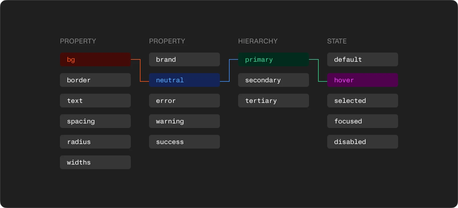
A token-first approach means organizing your Figma variables into three collections that reference each other. Each layer has a different job.
The brand collection holds raw values. Full color scales (50 through 950 for each hue), type sizes in pixels, spacing units, border radii. These values carry no opinion about where or how they get used. They are the complete set of options available to the system.
Color scales deserve attention. A proper scale runs the full range for each color family in consistent steps. Primary brand color, neutrals, semantic colors for success, warning, and error states. Building the complete scale upfront matters because six months in, someone will need a subtle hover state or a specific contrast pairing that was not planned. If the scale has gaps, the workaround is a hardcoded value. And hardcoded values are how systems start to break.
The alias collection adds meaning. Instead of a component referencing "Blue 500" directly, an alias token like "color-primary" or "color-surface" points to the brand value. The alias carries design intent. The brand token carries the raw number.
This is where dark mode stops being a problem. Two modes in the alias collection. Light mode maps "color-surface" to the lightest neutral. Dark mode maps it to the darkest. Every component using "color-surface" switches automatically. No duplicate components, no manual overrides, no separate dark-mode Figma file.
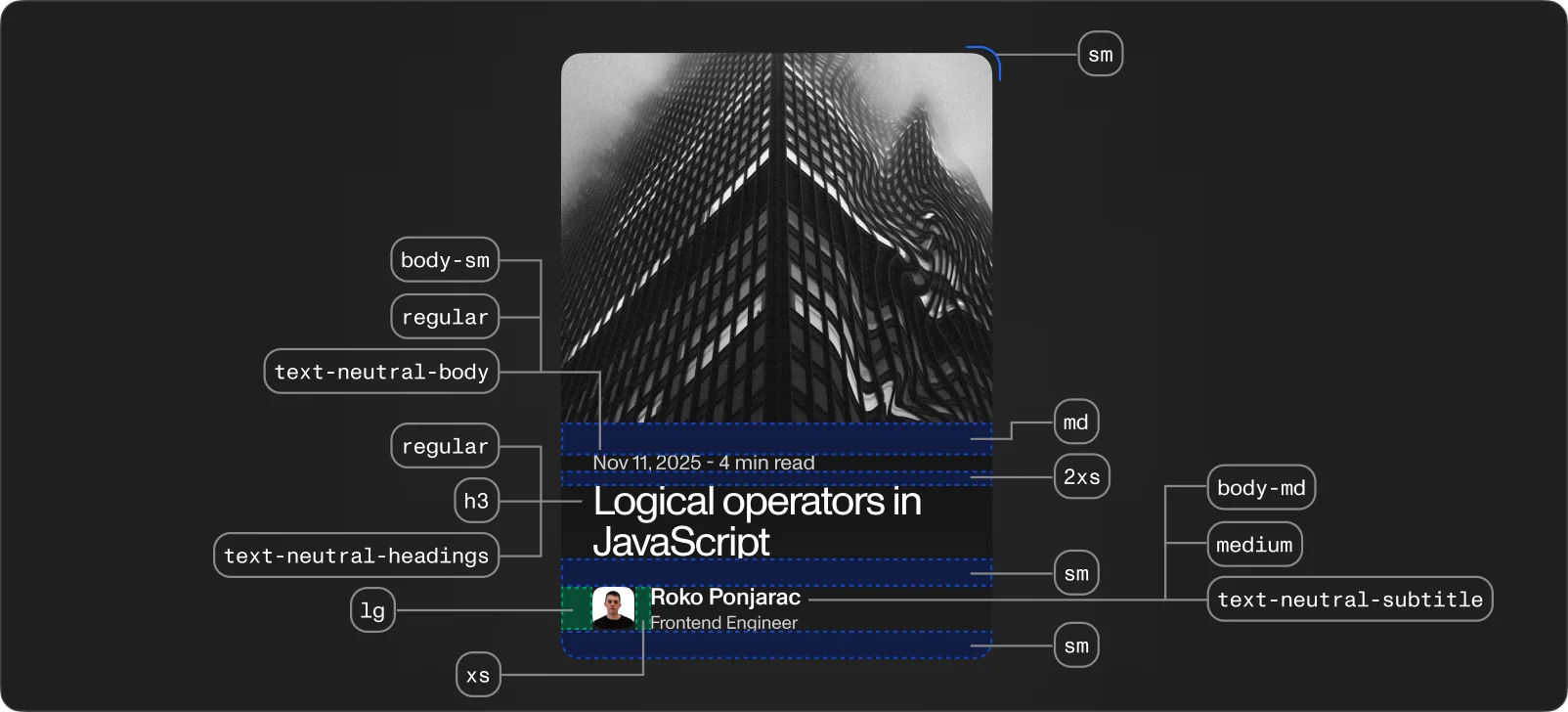
Typography works the same way. Instead of "16px Monument Grotesk Regular" applied manually across dozens of frames, an alias like "text-body-default" bundles font family, weight, size, and line height into one token. Update the alias, and the entire system follows.
The mapped collection connects tokens to components. Tokens like "button-background-primary", "input-border-default", "card-padding-horizontal" reference alias tokens, which reference brand tokens. Three layers.
This feels like over-engineering until the day someone needs to update the primary button color. With mapped tokens, it takes five seconds. Without them, it takes an afternoon of hunting through frames.
The three-tier structure also makes multi-brand support possible. Swap the brand collection and everything downstream resolves to new values. Same components, different visual identity.
And here is the part that connects back to AI. When I exported our styleguide as JSON and fed it to Claude Design, the file contained every token we use in production. Claude Design used some of them and ignored others. No feedback about which tokens it understood and which it skipped. But the fact that the tokens existed in a structured, layered format is exactly what Figma MCP reads. An AI agent using MCP does not generate a button from scratch. It pulls the button from your system. The token architecture is the interface between your design decisions and whatever tool (human or AI) consumes them.
A responsive collection for breakpoint-aware tokens
Beyond the three core layers, a fourth collection handles values that change across breakpoints. A heading that is 48px on desktop becomes 32px on mobile. Container padding shifts from 64px to 24px.
Defining these in a responsive collection with modes for each breakpoint means the values live in one place. Switch the mode, and the design shows how it adapts. No manual overrides per frame.
Typography benefits the most. Type scales need different proportions on different screen sizes. A responsive collection lets you define "heading-1-size" with separate values for mobile, tablet, and desktop. The component stays the same. The context changes.
Form components as the real test
Tokens are invisible infrastructure. The test of whether the architecture works is what happens when you start building components on top of it. Form elements are the hardest test because they carry the most state complexity.
A single text input has at least eight states: default, hover, focused, filled, disabled, error, error-focused, read-only. Each state needs distinct values for border color, background color, text color, placeholder color, and label color. Multiply that by every form element in the system (checkbox, radio, select, textarea, toggle) and the number of individual design decisions becomes large fast.
With mapped tokens, each of those decisions is made once and referenced everywhere. "input-border-default" references the alias "color-border-subtle". "input-border-focus" references "color-primary". "input-border-error" references "color-error". One component, all states driven by the token layer.
Labels and helper text work best as separate components that compose with the input. The label uses "text-label" tokens. Helper text uses "text-caption" tokens for the default state and "color-error" for errors. Building them as independent pieces means the same label component works with checkboxes, radios, and selects. No rebuilding.
Checkboxes and radios follow the same token pattern. Checked, unchecked, indeterminate. They share most of their token references with the input field. Focus rings, error states, disabled opacity. Define those for inputs, and the other form elements inherit them. Consistency becomes a property of the system rather than something enforced manually.
Once the atomic pieces exist, form groups compose them. A "form field" wraps a label, an input, and helper text. A "form section" groups multiple fields with consistent spacing from the spacing tokens. Every layer references the same foundation. Change the border radius token and every form element updates. Change the error color alias and every error state across the system reflects it.
Why this matters now more than before
Design systems have always mattered for consistency and speed. But AI tools add a new reason to get the architecture right.
In my previous tests, every AI design tool generated screens in a vacuum. Stitch, Pencil, Figma Make. You sit in a project with 200+ components and the AI builds everything from scratch, as if your design system does not exist. The visual is fine. The structure is empty.
The technical gap is closing. AI agents can already read your Figma tokens, components, and auto-layout rules through MCP. The bridge exists. The question is whether your system gives them something worth reading.
A flat list of hardcoded values is readable but not useful. A three-tier token architecture with clear naming, semantic aliases, and component-level mappings gives an AI agent enough context to generate output that belongs in your system rather than next to it. The brand collection tells the agent what colors exist. The alias collection tells it what those colors mean. The mapped collection tells it which color goes on which component in which state.
This is not about making AI tools do the design work. As I wrote before, tools are arms, not brains. The real skill is taste, conceptualization, product understanding. But a well-structured token architecture means the arm is reaching for the right parts instead of making up new ones.
Where design systems break
Design systems do not fail dramatically. They erode. A few patterns show up repeatedly.
Components without tokens. The system looks coherent for a couple of months. Then someone needs to update the primary color and finds it hardcoded in dozens of places. The effort required to fix it feels larger than the effort to start over. So the system forks, and two versions begin drifting apart.
Figma without code. A Figma library is half a design system. If tokens do not flow into CSS variables or Tailwind config, the design and the codebase drift apart with every sprint. The three-tier token structure maps directly to CSS custom properties. Brand tokens become root-level variables. Aliases reference them. Mapped tokens reference aliases. The architecture is the same on both sides.
Adoption friction. A design system that is harder to use than building from scratch will not get used. If a developer can grab a shared component and ship faster than writing custom styles, they will use the system. If they cannot, they will build their own version.
What comes next
The foundation is the brand tokens. The structure is the alias and mapped layers on top. The proof is the first set of components built entirely on that foundation.
Dark mode, multi-brand, responsive breakpoints, and component consistency all run through the same three-tier architecture. Every decision made at the token level flows through the entire system. And when AI tools finally connect to your design system through MCP (some already do), those same tokens become the shared language between you and the machine.
The work is in getting those first layers right. After that, building on top of them is the easy part.


