TL;DR: No. Two weeks ago we published a post about AI design tools and the gaps keeping them from production work. Stitch, Pencil, Figma Make. All of them produce good-looking screens. None of them read your design system. None of them create reusable components. The visual output is there. The structural output is not.
Three days ago, Anthropic launched Claude Design. This one is different from the others because of who built it. Not a startup, not a Figma plugin team. Anthropic. The company behind Claude, one of the most capable AI models on the market. If anyone has the infrastructure to make AI-generated design work properly, it is them.
We tested it on our own website. Here is what happened.
What Claude Design promises
Anthropic's own positioning is modest. Claude Design is for "creating prototypes, slides, and one-pagers." Not production design. Not full design systems. Not replacing your designer. Prototypes, slides, and one-pagers.
Read it again. The company behind it does not claim it replaces designers. The internet does. Every launch post, every X thread, every "designers are dead" take projects onto the tool something its own creators never promised. Claude Design is, by Anthropic's own words, a prototyping tool. The same category as Stitch, Pencil, and Figma Make. A bigger name behind it does not change the category.
Here is the thing: it does not even do the one-pagers well. We tried. We asked Claude Design to create a one-pager. The result had layout bugs, broken alignment, inconsistent spacing between sections, and text overflowing its containers. Not edge-case issues. Visible problems anyone would catch on a first look. If the tool struggles to produce a clean single-page layout without major design mistakes, the conversation about replacing full production workflows is premature. It has not earned the small scope yet.
Where it differs is the input layer. Claude Design accepts screenshots, URLs, and design system files. It understands component hierarchies better than Stitch or Figma Make did in our previous tests. You feed it your styleguide, your tokens, your component definitions. It claims to design within your system instead of starting from scratch.
The component awareness is real. When you describe a card layout and reference an existing component structure, Claude Design responds with something closer to your system than anything Stitch or Pencil produced. It understands nesting. It understands variant logic. On paper, this is the gap-closer.
On paper.
The test
We gave Claude Design three inputs for the workspace.hr homepage:
- A link to the live website
- A screenshot of the current homepage (Claude Design requested this, a good sign showing it knows a URL alone does not capture visual intent)
- A .json file exported from Figma containing our full styleguide: colors, typography, spacing tokens, component definitions
Three inputs. More context than we have given any AI design tool before. The JSON alone contained every token we use in production.
What came back
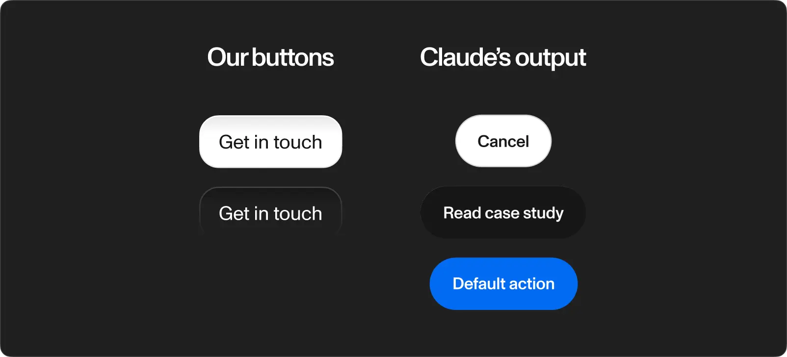
The output contained components not present in our system. Buttons not from our library. Spacing following no token from the JSON file. Typography pairings we never defined.
The layout structure was reasonable at a glance. The kind of output looking fine in a screenshot on X but falling apart the moment you compare it to the source material. The same pattern from every tool we tested before, now repeating inside the tool built by the biggest name in AI.
Component fidelity. Claude Design built elements resembling our components but matching none of them exactly. A button with the wrong border radius, padding, and font weight is not a button from your design system. It is a made-up button wearing a costume.
Styleguide comprehension. The JSON export contained everything: color tokens with exact hex values, type scales, spacing units. Claude Design used some of them and ignored others. No feedback about which tokens it understood and which it skipped. It took the file, said thanks, and did its own thing with half of it.
The half made-up problem. The output was not completely wrong. It was half right. This is worse than getting it entirely wrong, because a completely wrong output is obvious. A half-right output looks credible until a designer inspects it, and by then someone already shared the screenshot in a Slack channel calling it "done."
The usage ceiling
This is the part most coverage skips.
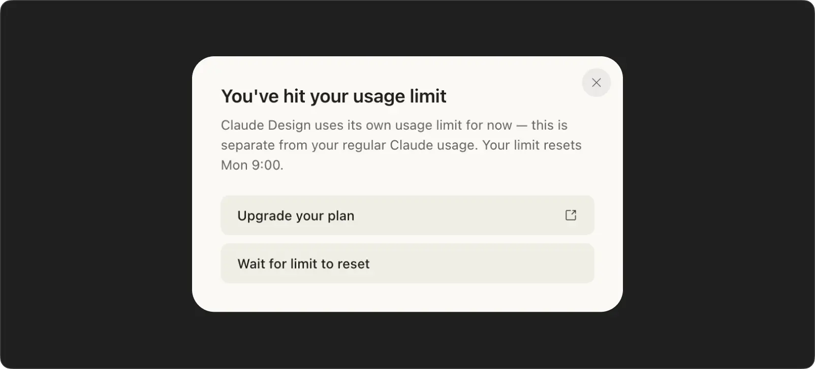
Claude Design has its own usage quota. Separate from the standard Claude conversation limits. We got 4 prompts before the quota ran out. No refill for a week. No option to buy more. Before we had any remaining tokens left to iterate, we were already locked out.
Four prompts is one attempt and three corrections. In a real design process, you iterate dozens of times on a single screen. You test variations, swap components, adjust hierarchy, align spacing. Four prompts gets you a rough draft and two failed attempts at fixing it.
The AI slop problem
Every output from Claude Design looks the same.
Not the same as my design system. The same as every other Claude Design output. The same rounded corners. The same card shadows. The same section rhythm. The same safe, inoffensive layout patterns repeating across completely different briefs. Feed it a SaaS dashboard and a restaurant website and the structural DNA is identical.
This is what people call AI slop. Outputs technically competent but visually interchangeable. The same model, the same training data, the same safe choices. Dribbble is already full of AI-generated concepts impossible to tell apart.
In the past, to create a bad design you had to be a bad designer. Today all you need is a free plan.
When every tool produces the same visual language, brand identity disappears. The nuance between "this feels like our product" and "this feels like a template" vanishes.
How we see this at Workspace
We test every AI design tool on launch. We recently used Figma Make for a booking flow redesign and spent 90 minutes rebuilding the output with our real components. Claude Design would not have changed the outcome. The component awareness is better. The fidelity is not there yet.
On a recent client project, AI did the first sketch in minutes. The design process took weeks. 30+ iterations by hand. Claude Design, with four prompts per week, would not have gotten past the first sketch.
Tools are arms, not brains
Every AI design tool, Claude Design included, is an extended arm. Faster than a human hand. But an arm without a brain behind it produces motion, not meaning.
The real skill of a designer is not placing elements on a screen. It is taste. The instinct for what belongs and what does not, built over years of looking at good work and bad work and learning to tell the difference instantly. A junior designer and a senior designer use the same Figma. The difference is not speed. It is the thousands of micro-decisions made in a second: this weight, not this one. This spacing, not this one. This hierarchy, because the user needs to see the price before the description on a charter listing, but the description first on a crewed yacht page.
A designer also conceptualizes. They take "users need to compare 140 boats and book one" and turn it into a sequence of screens telling a story the user follows without thinking. They understand the product deeply enough to know which information matters at each step and which gets in the way. They communicate the product to the user through visual hierarchy, interaction patterns, and the rhythm of a flow.
Claude Design arranges elements. It does not understand why those elements are there. It does not know the user. It does not know the product. You prompt it and it responds. You do not prompt a senior designer. You describe the problem and they come back with an approach you did not think of.
What comes next
Claude Design is a better tool than the ones we reviewed two weeks ago. Anthropic brought real infrastructure to the problem. Component awareness, design system input, structured output. The direction is right.
The execution is not there. The components are half made-up. The styleguide is half-followed. The outputs all look the same. And four prompts per week is not a design tool. It is a demo with a cooldown timer.
Anthropic said it themselves: prototypes, slides, and one-pagers. Not production design. Not a designer replacement. A prototyping tool with better inputs than the ones before it. The arms keep getting stronger. The brain stays human. Taste, conceptualization, product understanding, user communication. No prompt replicates these. No model trains on them. Designers are not dead. They never were.